On Book Covers
Book covers are supposed to serve as little billboards that tell the reader what kind of book they are and invite the reader to pick them up and examine them further. Read the back cover copy, maybe, or browse chapter 1.
What makes a good cover?
I’m probably not the person who should be answering this question because I’m not very visual and am terrible at telling good covers from bad. I’m so bad that my writer friends laugh at me.
If you’re interested in seeing someone’s idea of bad covers, here’s a cruel but informative website: Lousy Book Covers. I can’t tell from looking what makes the covers on that site bad, but the tags are informative.
How covers are developed
Many covers these days are photoshopped. With a big publisher, the writer may not have any input into what their cover looks like.
I’ve published with three different small presses, and my covers have all been done by artists the publishers hired. In my experience, the artist asks for an idea of what the publisher wants and the publisher passes that request on to me. As is think we’ve established, I’m bad at knowing what counts as a good cover, so the first time this happened, I went to my local bookstore and asked the clerk whether YA books typically had a person or an object on the front cover.
She said it was about half and half. One issue with putting a person on the front cover is that you may not want to pin the character’s appearance down too tightly, so the reader can imagine a character they like. That’s one reason people on the cover are sometimes shown only from the shoulders down.
At any rate, I send my ideas; the publisher approves them and sends them to the artist. Then I eventually get some sort of sketch and we decide whether to proceed.
From sketch to cover
The only book for which I still have the sketches is my one middle-grade book, Finders Keepers. Here they are.


The bottom one is the first one I saw. It shows one of the book’s opening scenes in which 12-year-old Cade is fetching water from a well. I apparently hadn’t made clear that the well was in a medieval city street, so the artist had sketched in trees. The one on the top shows the corrected version and is the basis for the final cover.
Here’s the art work for the final cover.

What you’re looking at is called a “flat,” that is it’s the flattened version of the cover that wraps around the book. Because the book is middle grade, the character is sketched in a more cartoonish fashion. I like this cover a lot, especially the rat on the barrel on the left.
Covers in a series
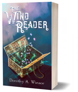
Another concern is that covers in a series should visually indicate that they belong together. Here are the front covers for The Wind Reader and The Wysman. Notice how the colors, layout, and fonts echo one another.


For obvious reasons, I’m always curious to know what prompts a reader to pick up a book. If you have favorite covers, I’d love to hear about them.
_________________________________________________________________________
The Wysman
Street kids are dying. Does anyone care? Former street kid Jarka risks his new life as an apprentice Wysman when poor children begin disappearing and he suspects the monster grabbing them comes from the castle.
Amazon Barnes & Noble Indiebound Direct from Inspired Quill